Packaging · Beverage · Product Imagery
Black Irish
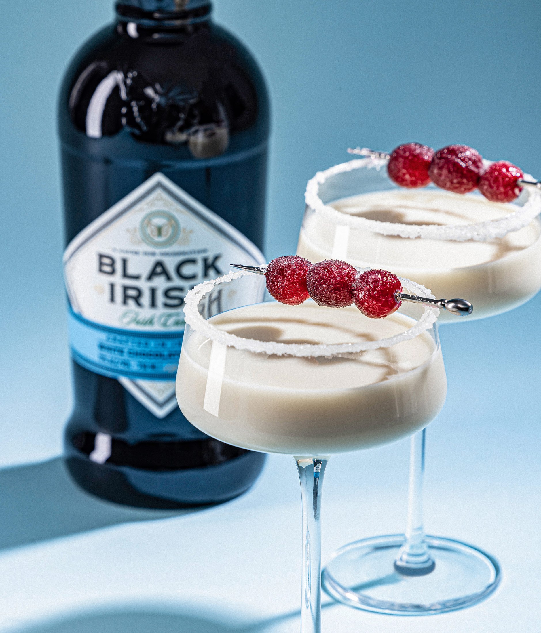
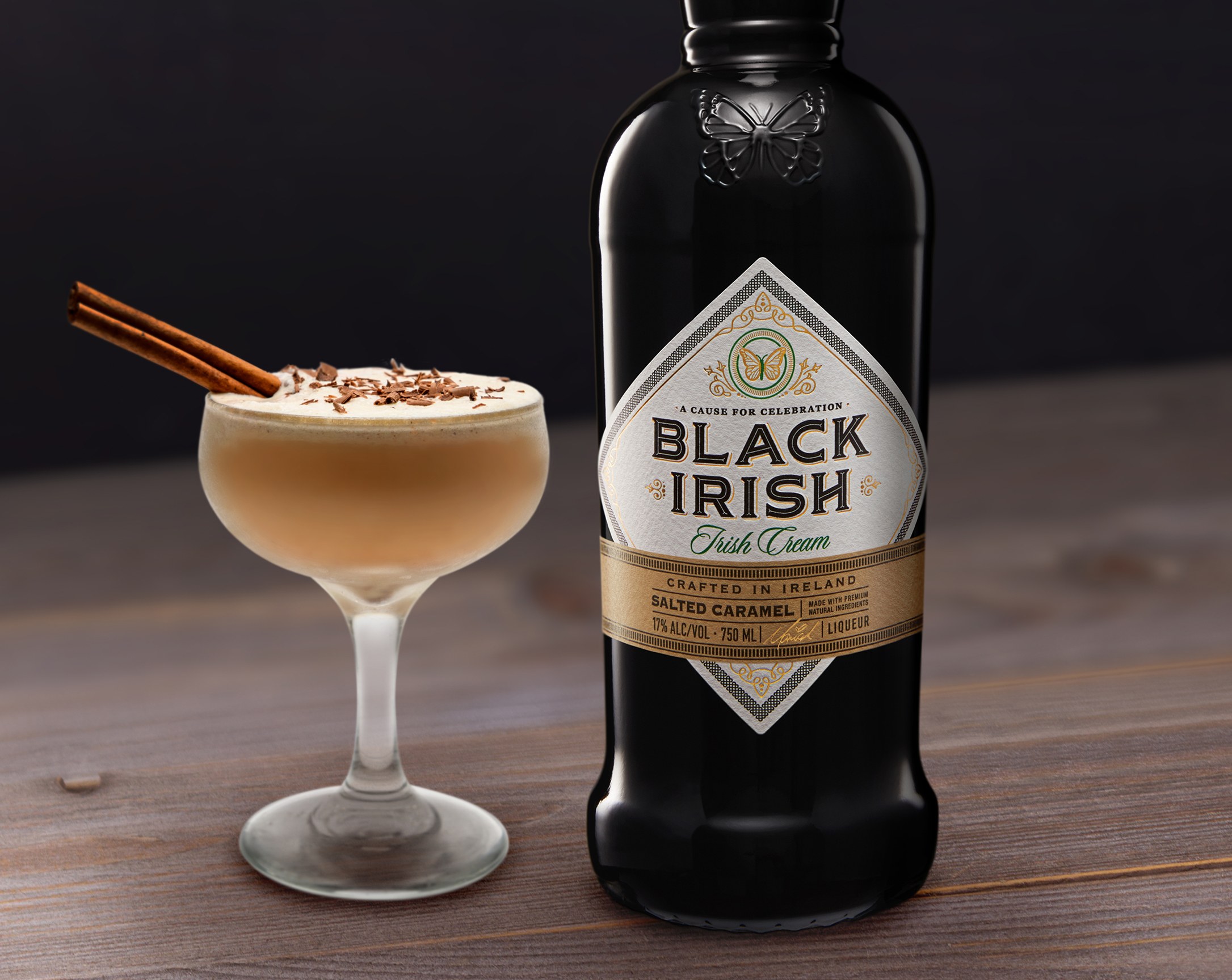
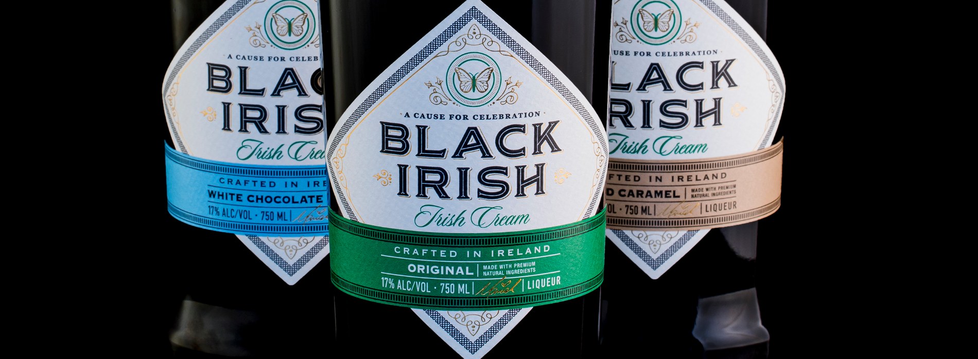
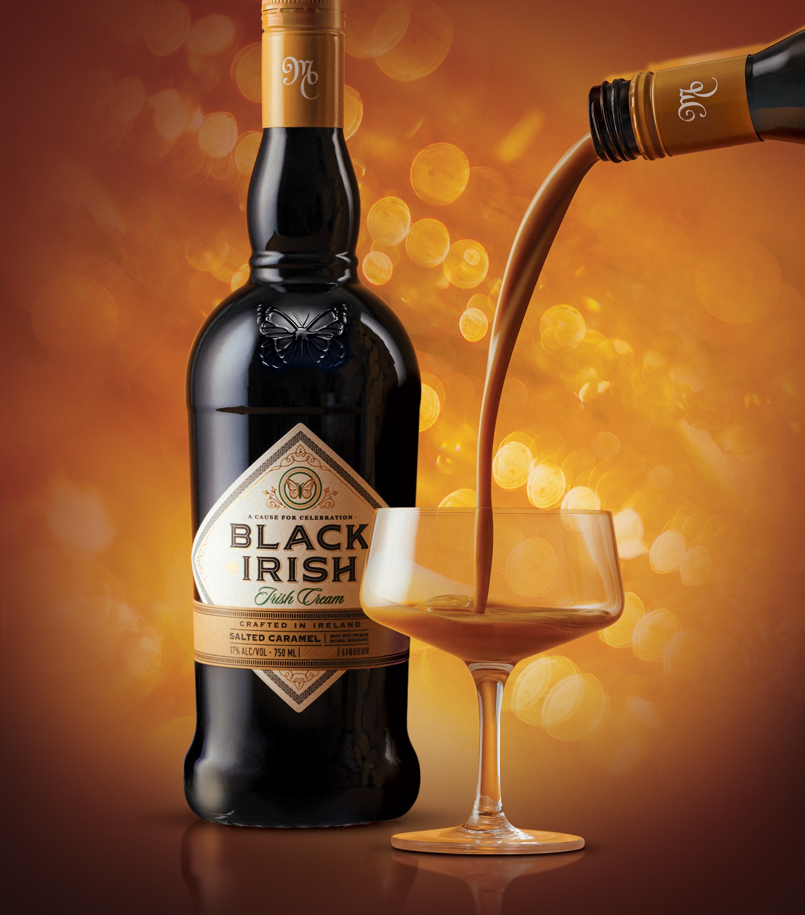
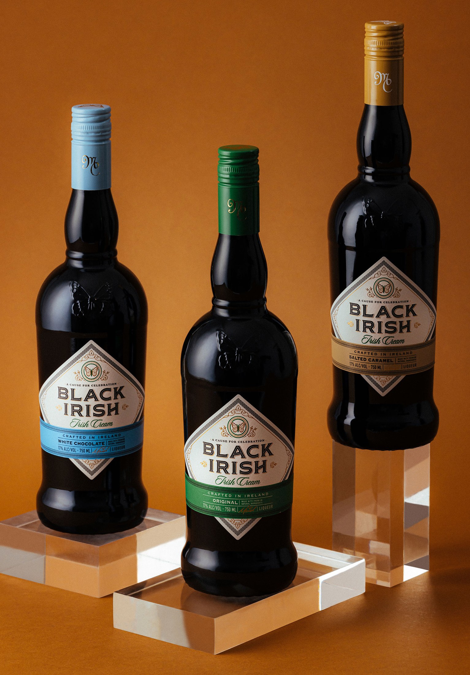
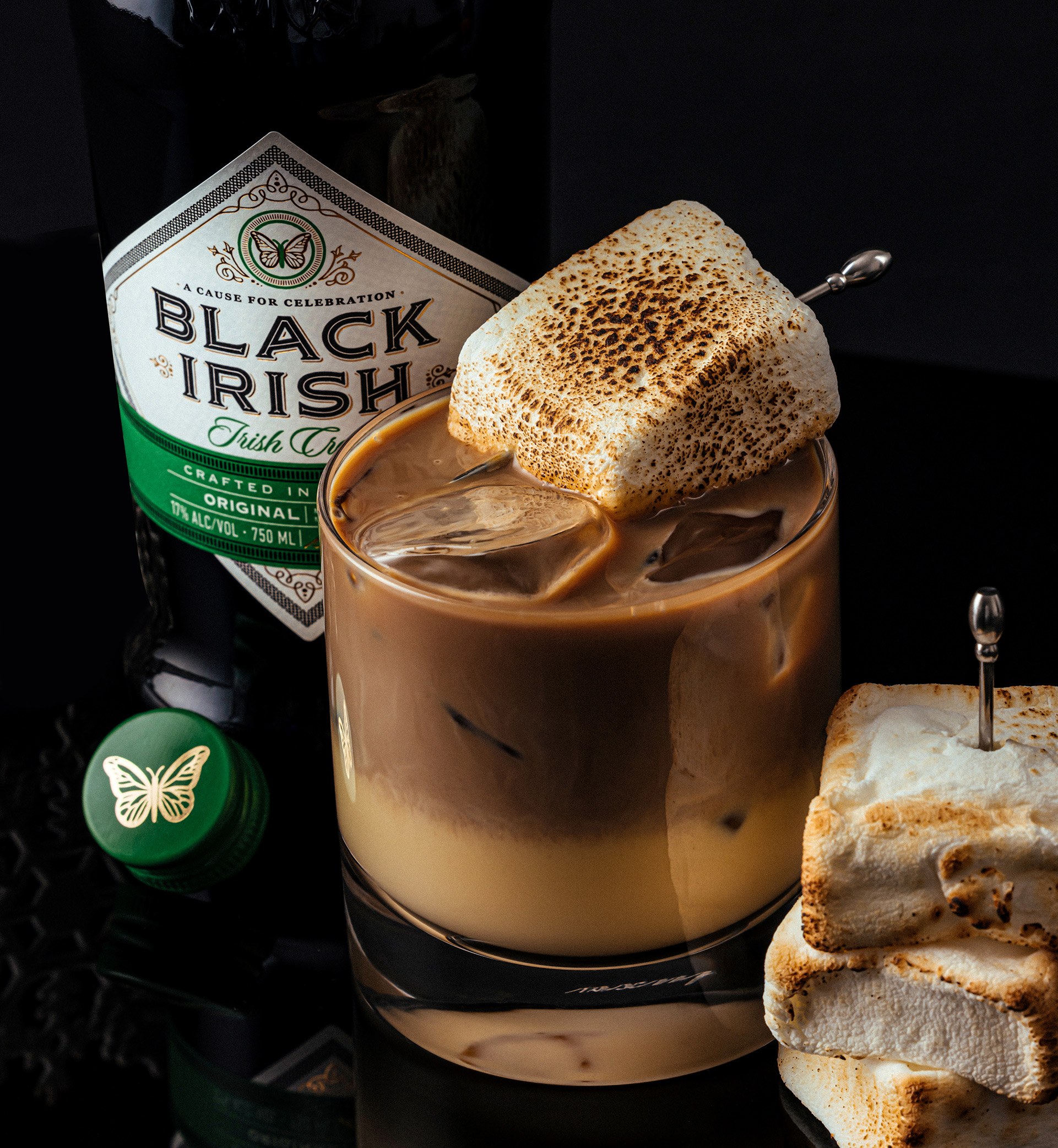
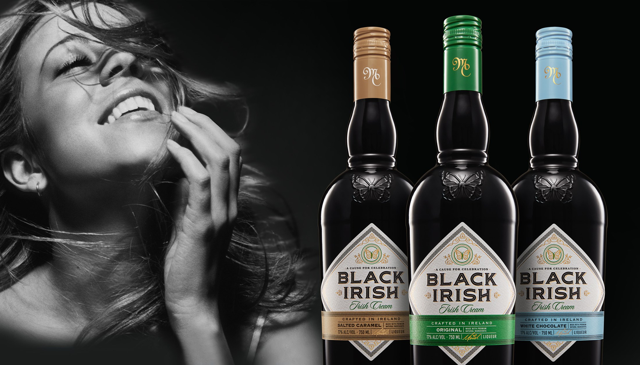
A beverage label and product imagery system using dark tones, flavor cues and premium staging to make multiple product expressions feel like one elevated family.
Case Note
A richer beverage system built around contrast, flavor and family consistency.
The problem was range control. Dark beverage packaging can look premium, but it can also become visually heavy when the line expands across flavors and supporting imagery.
My role was to use contrast deliberately: dark bottle language, brighter flavor signals and product staging that keeps the system indulgent, legible and consistent across multiple expressions.