Corporate Label Systems · Costco Retail Photography
From label design to shelf-ready imagery.
A corporate retail workflow across Kirkland Signature seasoning products: label hierarchy, production consistency, Costco warehouse shelf proof and clean white-background photography for e-commerce use.

Case Note
Corporate design only works when it survives production, shelf placement and photography.
The problem is consistency at scale. A label system has to stay readable across flavors, materials and package sizes, then still hold up under Costco warehouse lighting where shoppers are scanning from a distance.
My value is the full chain: design support, production-ready packaging updates, real shelf documentation and white-background photography that can move directly into retail pages, sales decks and e-commerce listings.
Keep brand hierarchy, flavor clarity and front-panel readability consistent across SKU variations.
Prepare label artwork with the discipline required for actual packaging output and internal review.
Document the product system in a real Costco warehouse environment, not just in a controlled mockup.
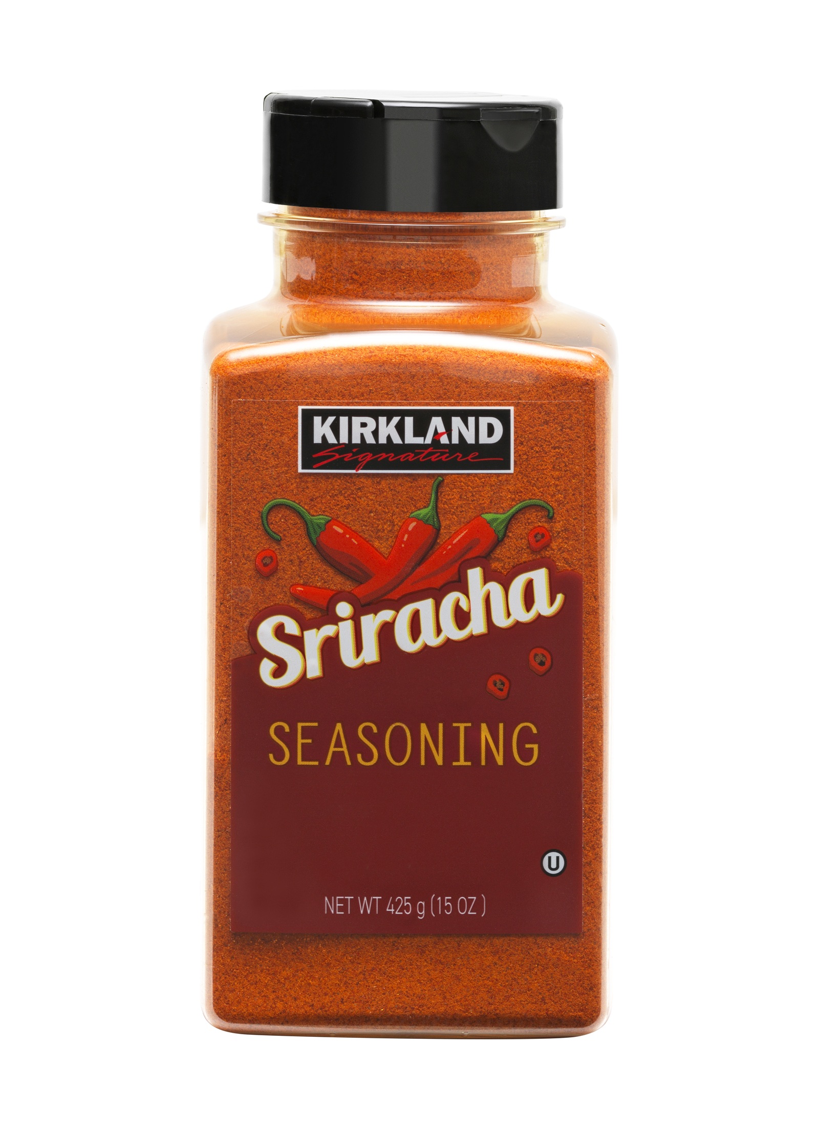
Capture clean, color-aware packshots built for retail pages, sales decks and product listings.
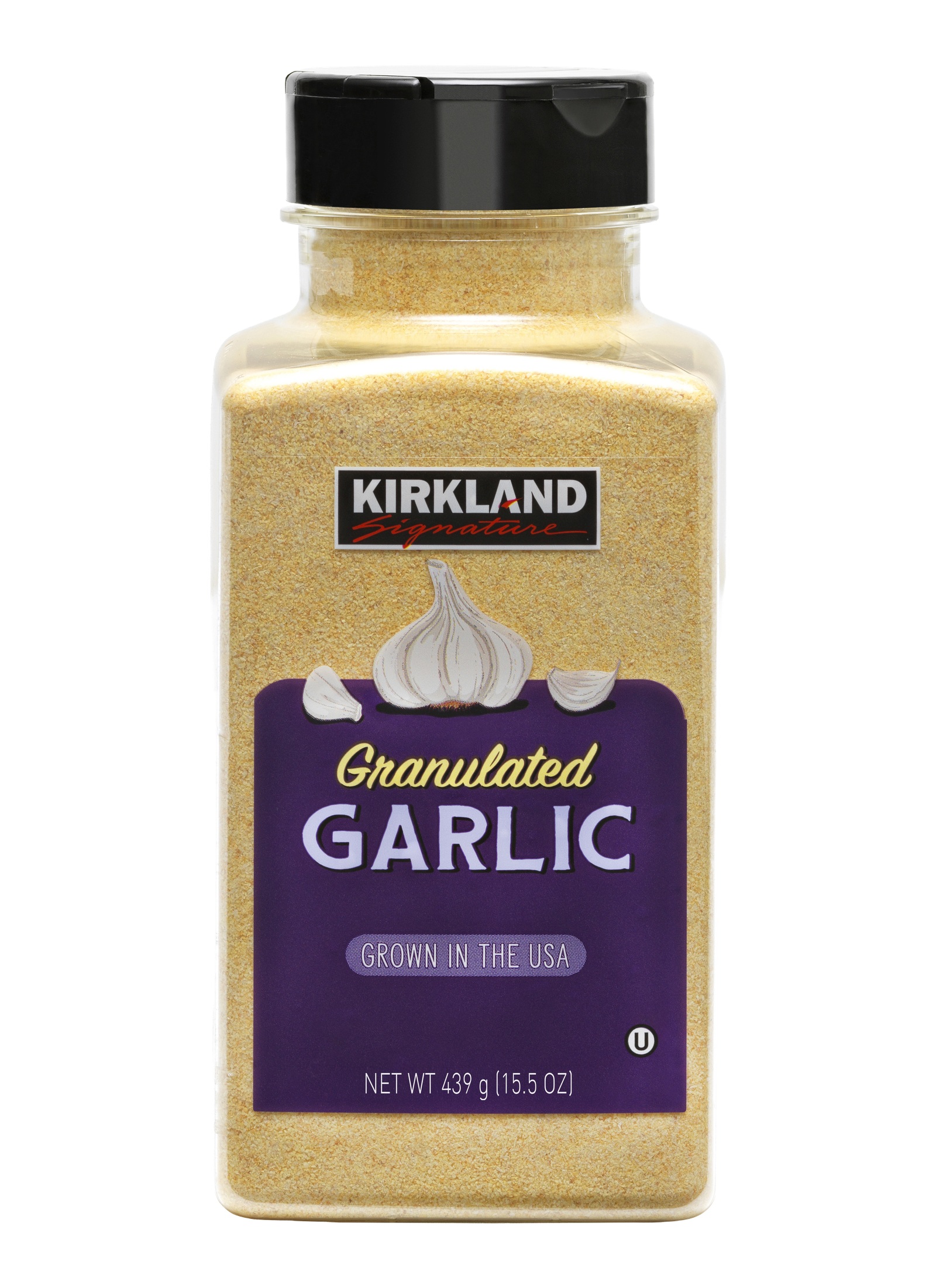
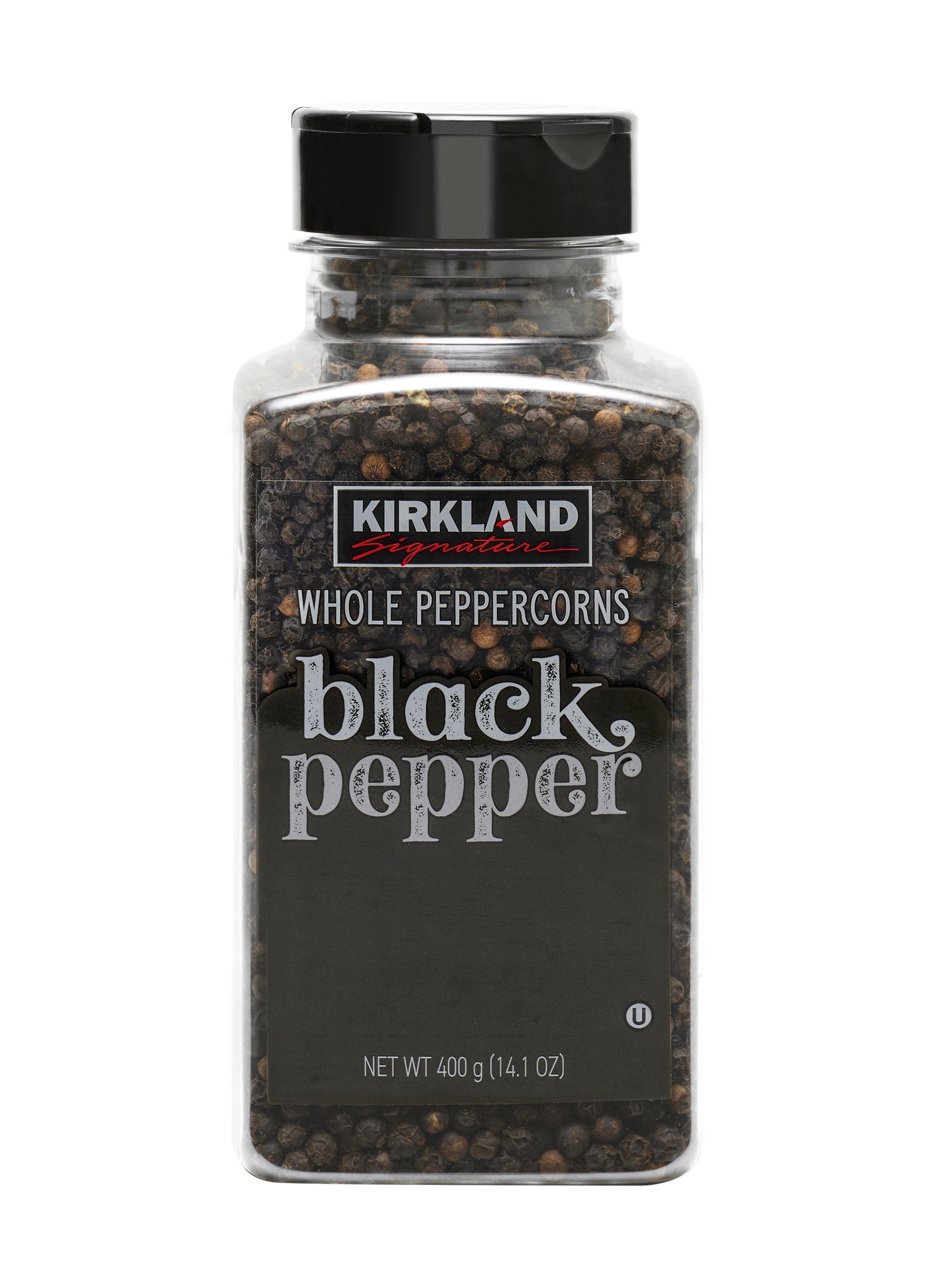
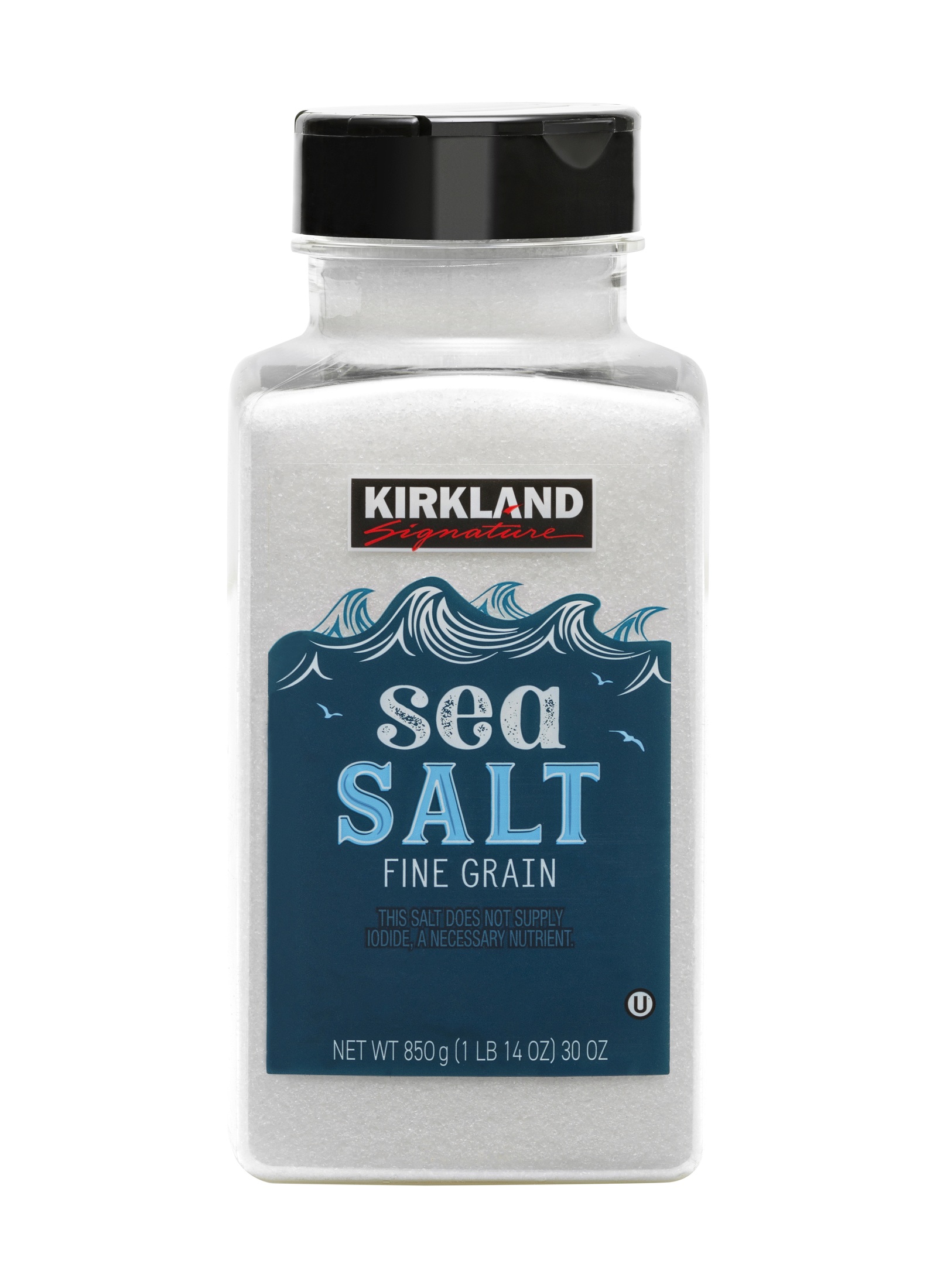
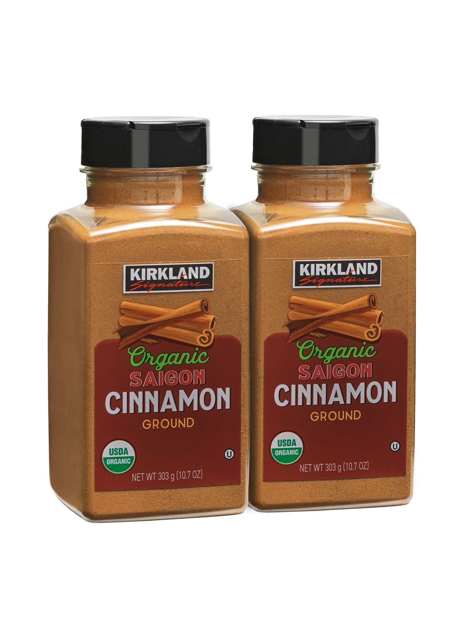
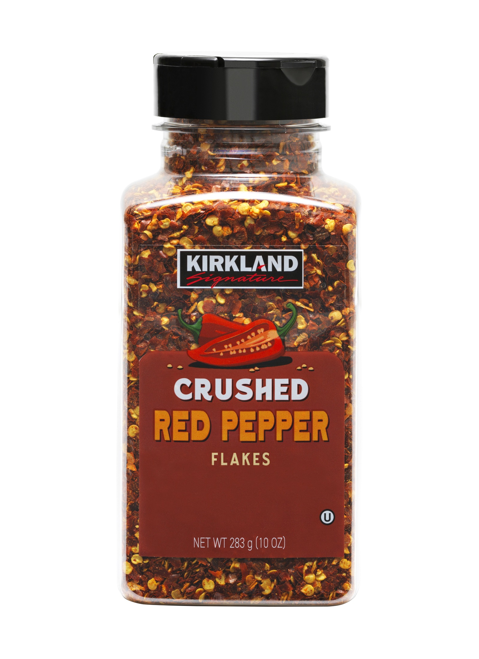
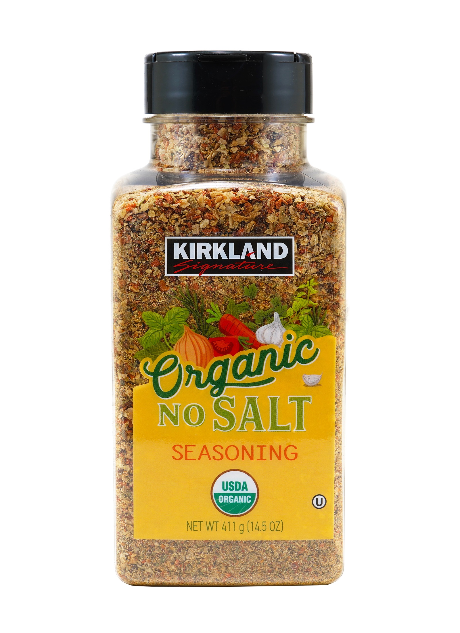
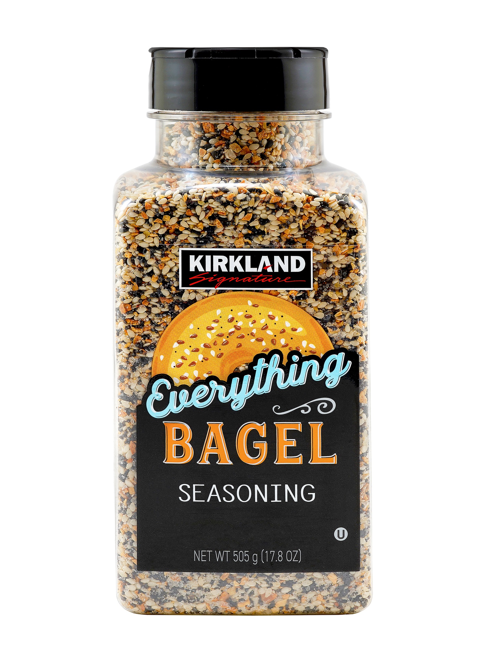
White-background product photography
White-background images that keep the label system honest.
The packshots are intentionally quiet: no decorative noise, no lifestyle distraction. The point is accurate color, readable labels, consistent scale and a polished retail finish.
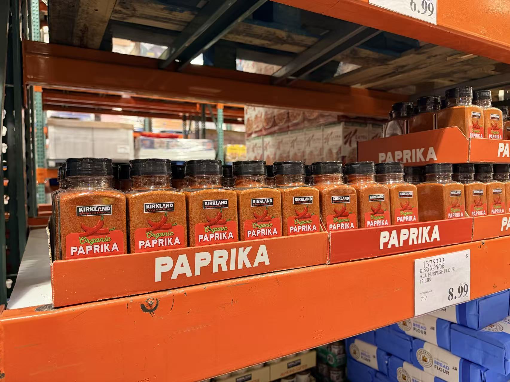
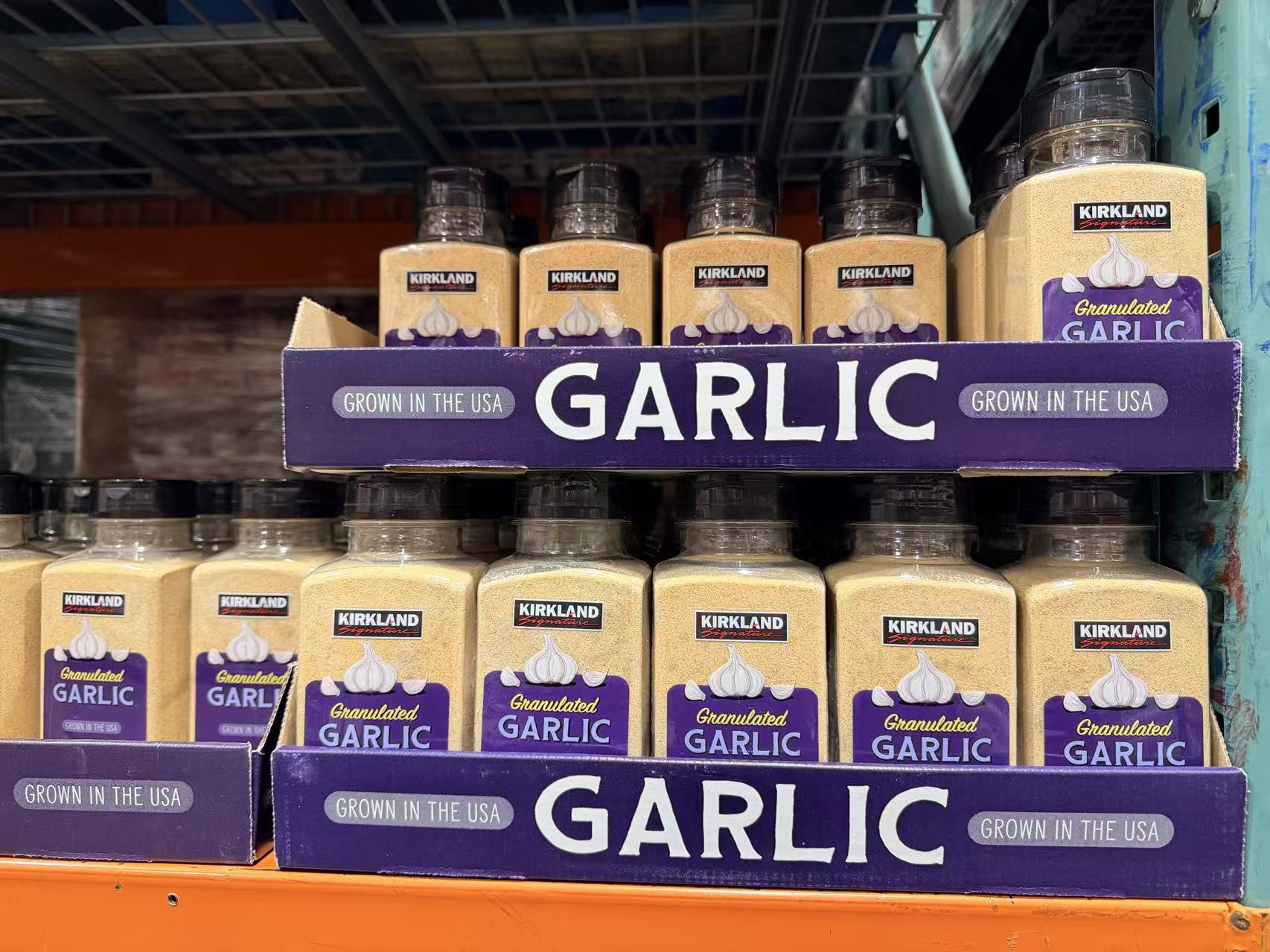
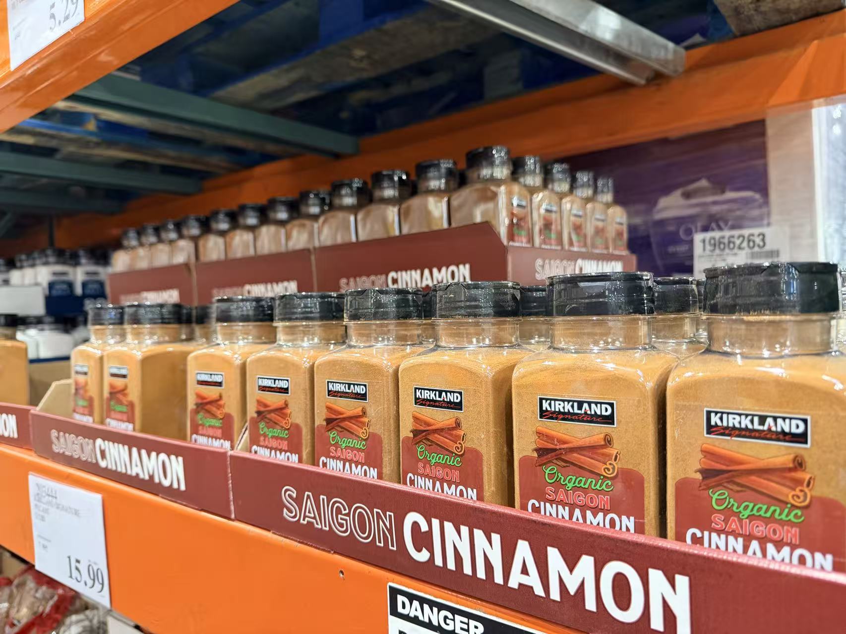
Costco warehouse shelf presence
The work has to survive warehouse lighting, bulk displays and real shopper distance.
These shelf images prove the system in the environment where it actually matters. Color blocks, naming, label contrast and tray presentation all need to stay readable in a visually loud retail setting.
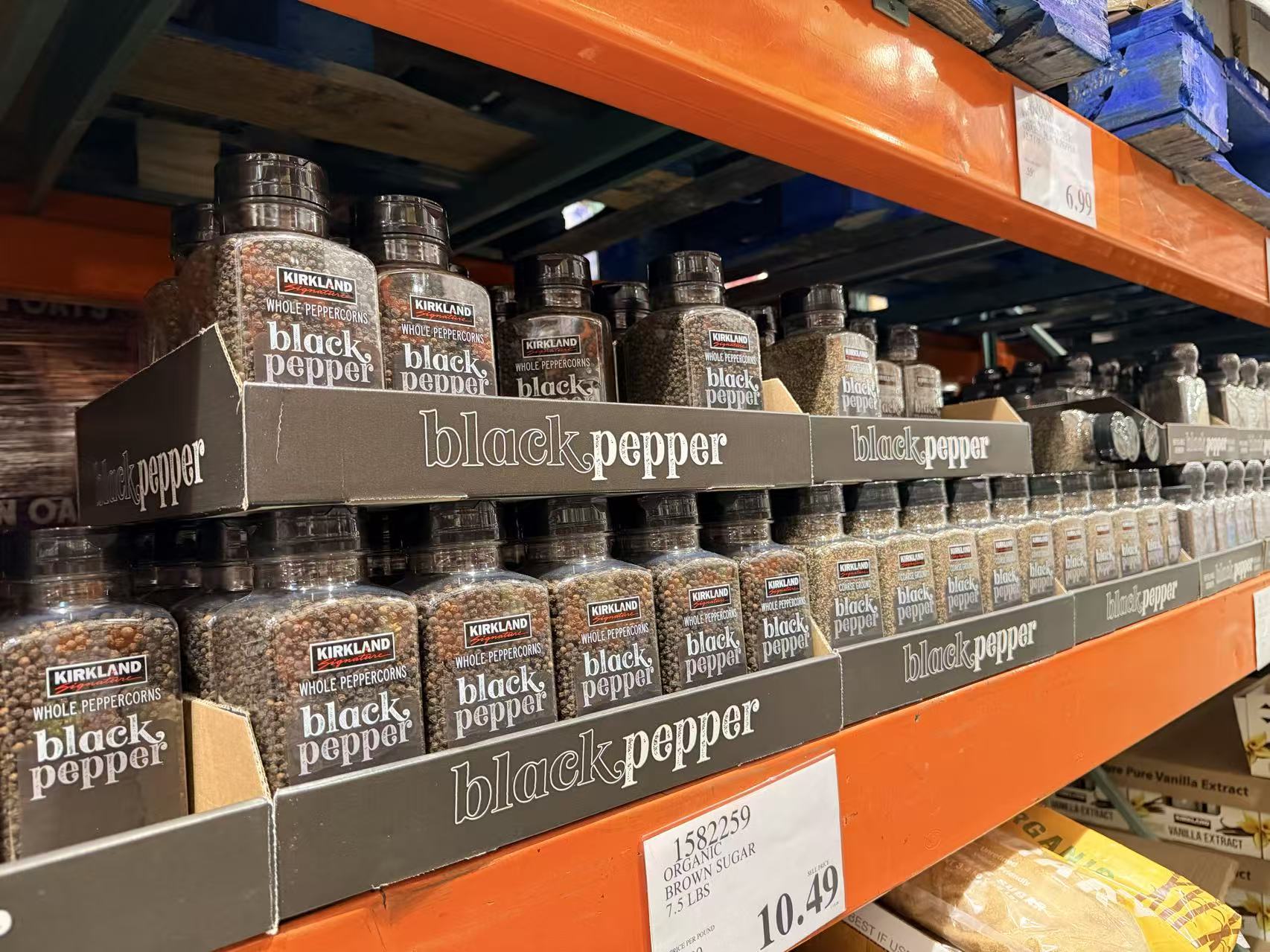
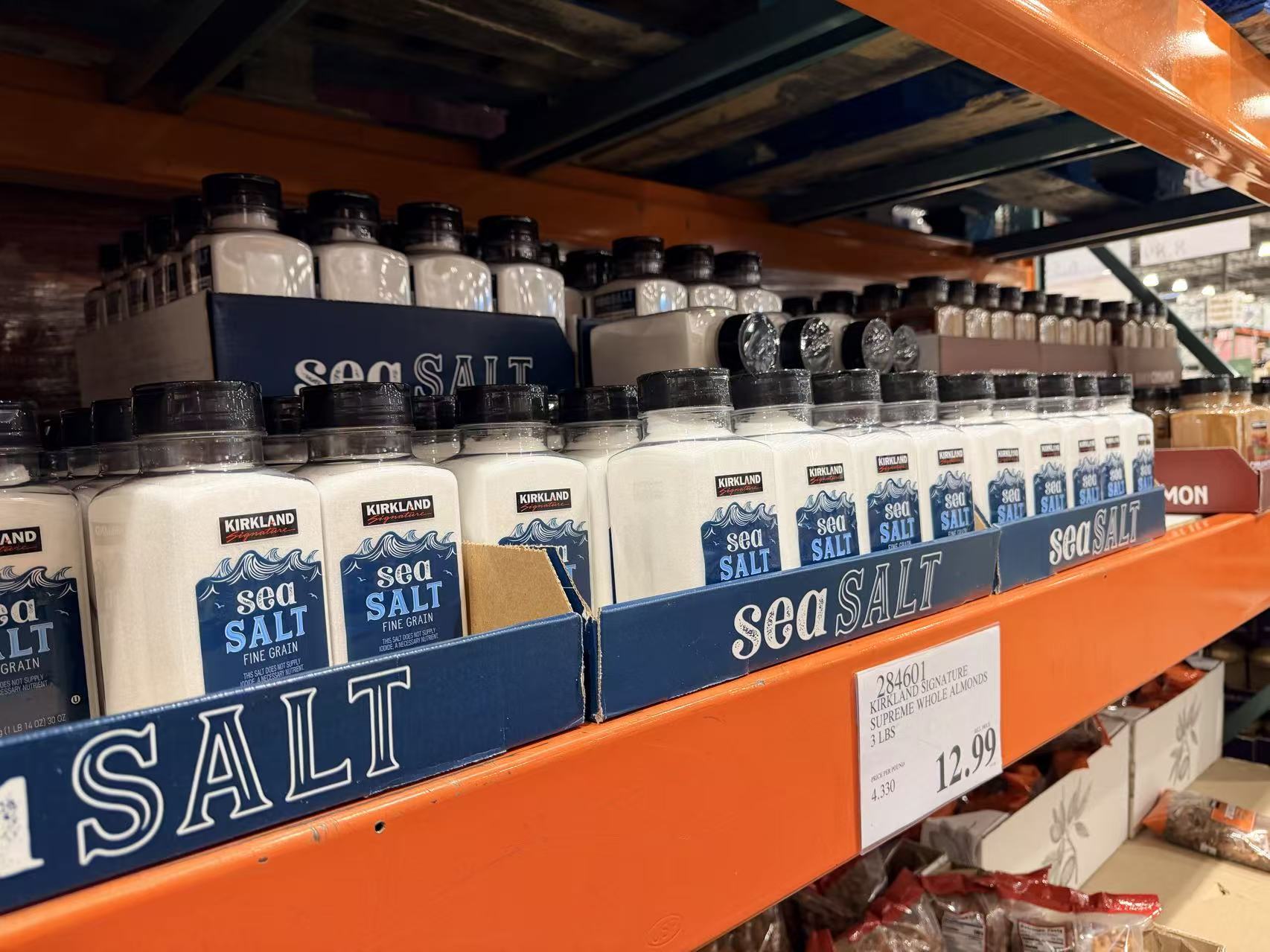
Range consistency
Same shelf language. Different products. One standard.
The Result
A practical retail system connecting label design, production, shelf presence and product photography.
This is the kind of work that rarely needs to shout. It needs to be correct, consistent and useful everywhere the product appears: label file, warehouse shelf, sales deck and e-commerce listing.