Premium Packaging · Beauty · Retail Display
Gold Q
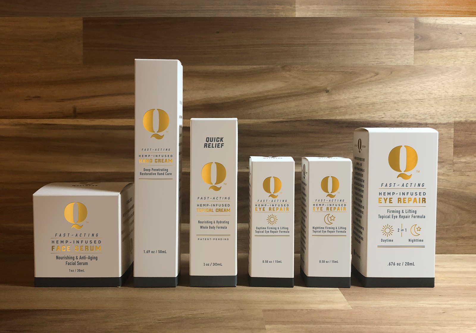
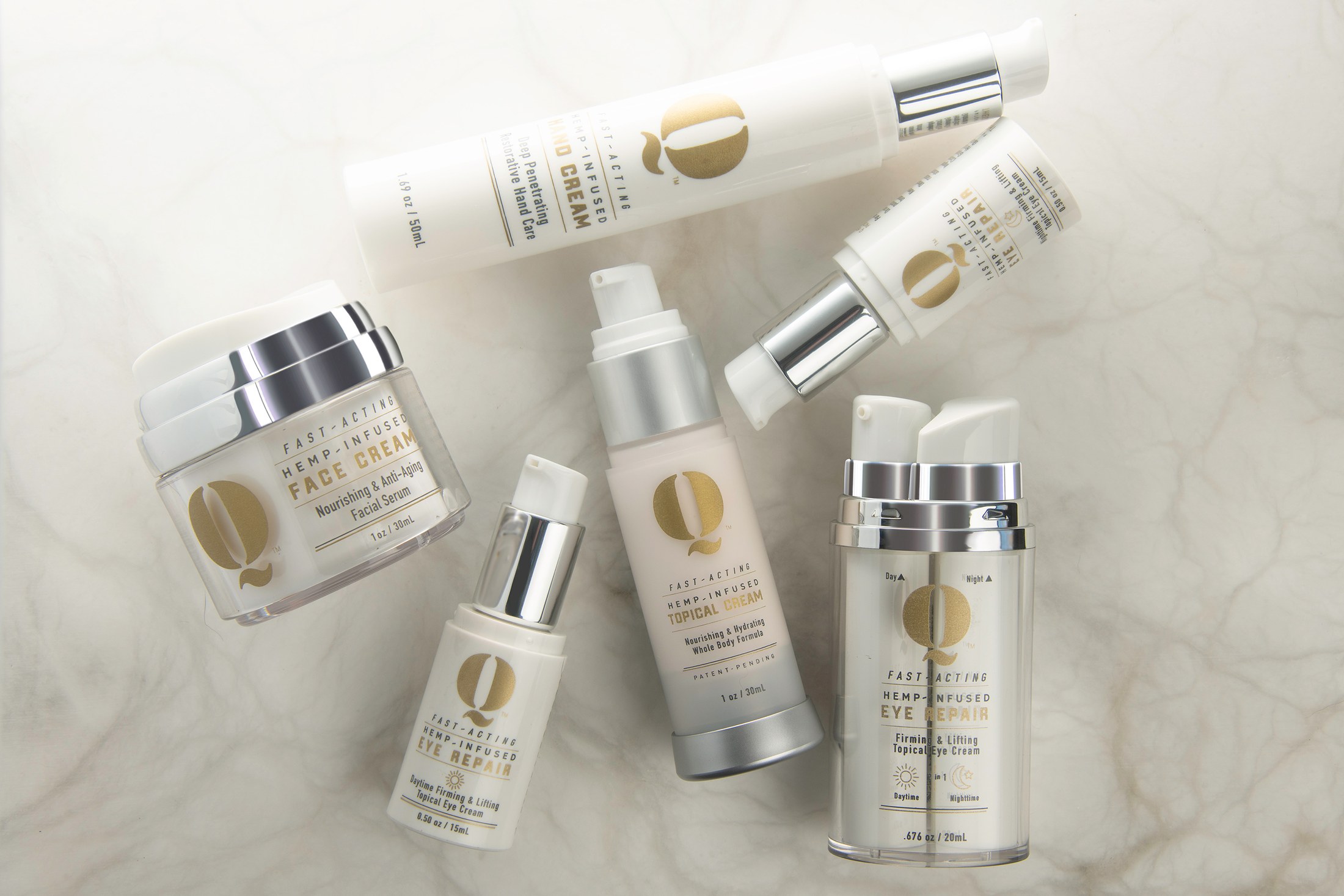
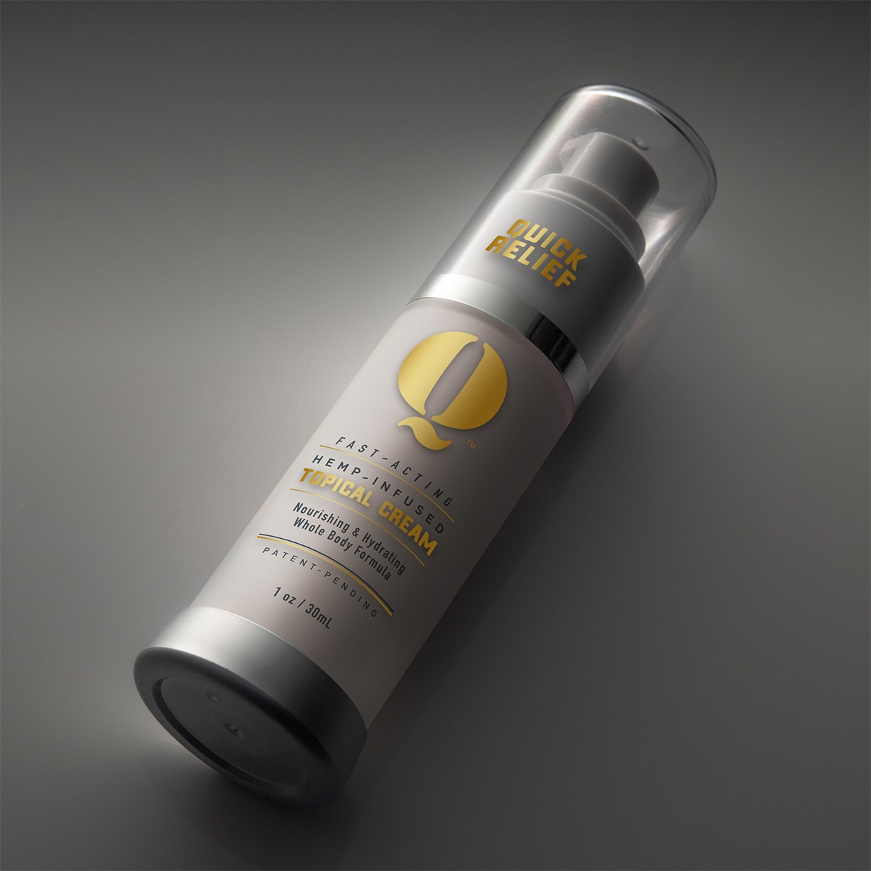
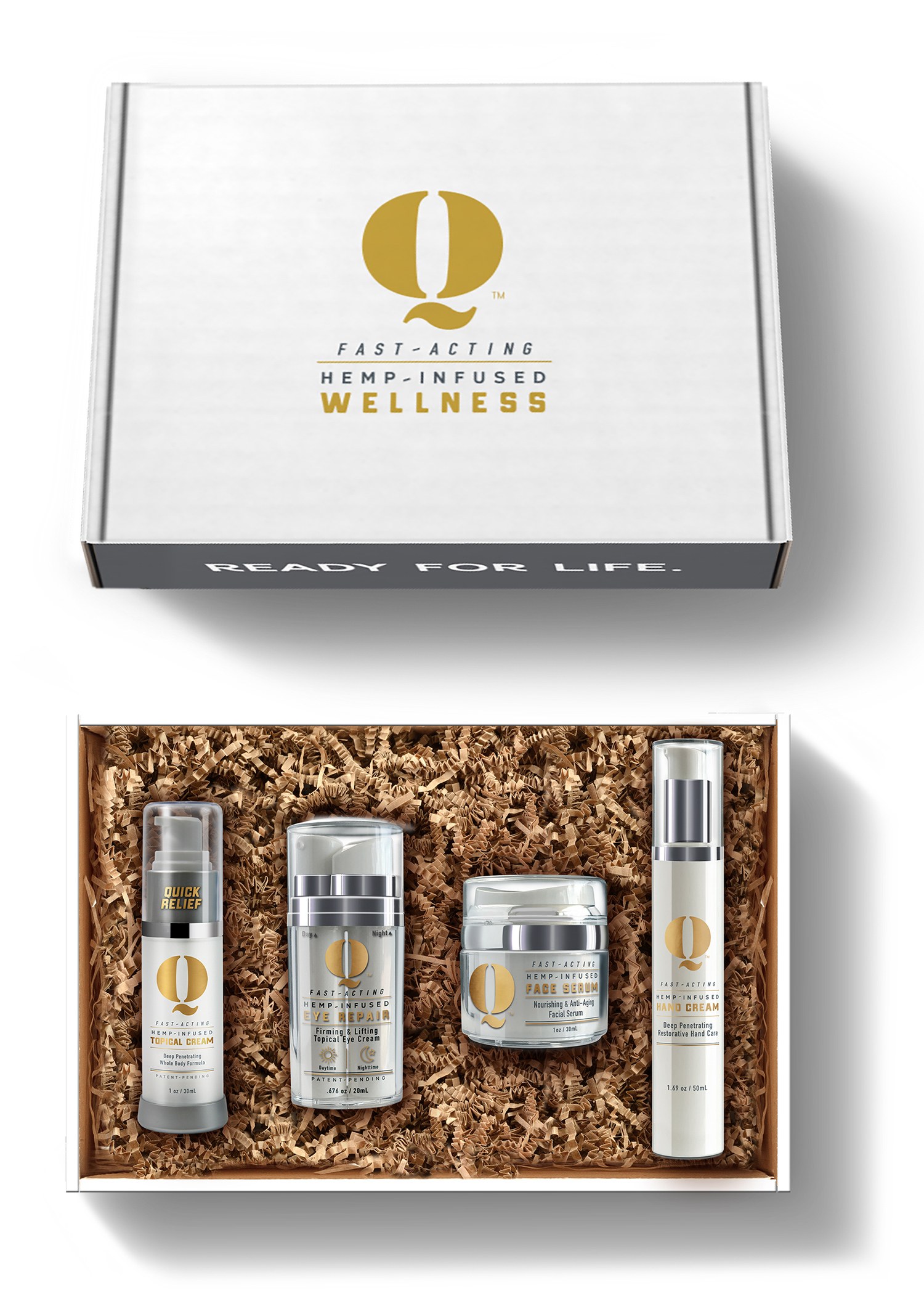
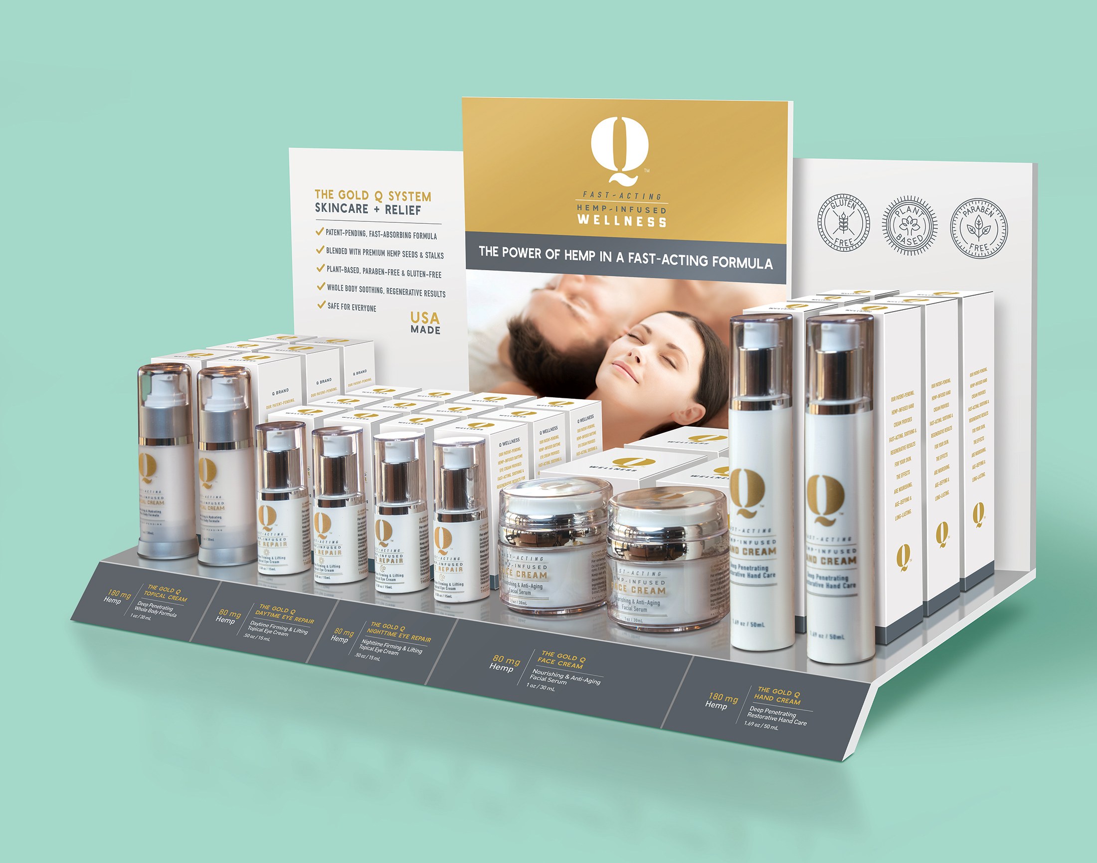
A premium beauty packaging system using restrained color, metallic cues and clean hierarchy to make a multi-product line feel trustworthy, organized and retail-ready.
Case Note
Premium beauty packaging built around trust, consistency and shelf clarity.
The challenge was to make the line feel premium without becoming vague or decorative. Beauty packaging needs aspiration, but it also needs enough hierarchy for customers to understand product purpose and range quickly.
My focus was family architecture: controlled white space, metallic cues, consistent naming zones and product layouts that allow individual items to stand alone while the full set reads as a unified retail presentation.