Naming · Branding · Digital System
Griddy
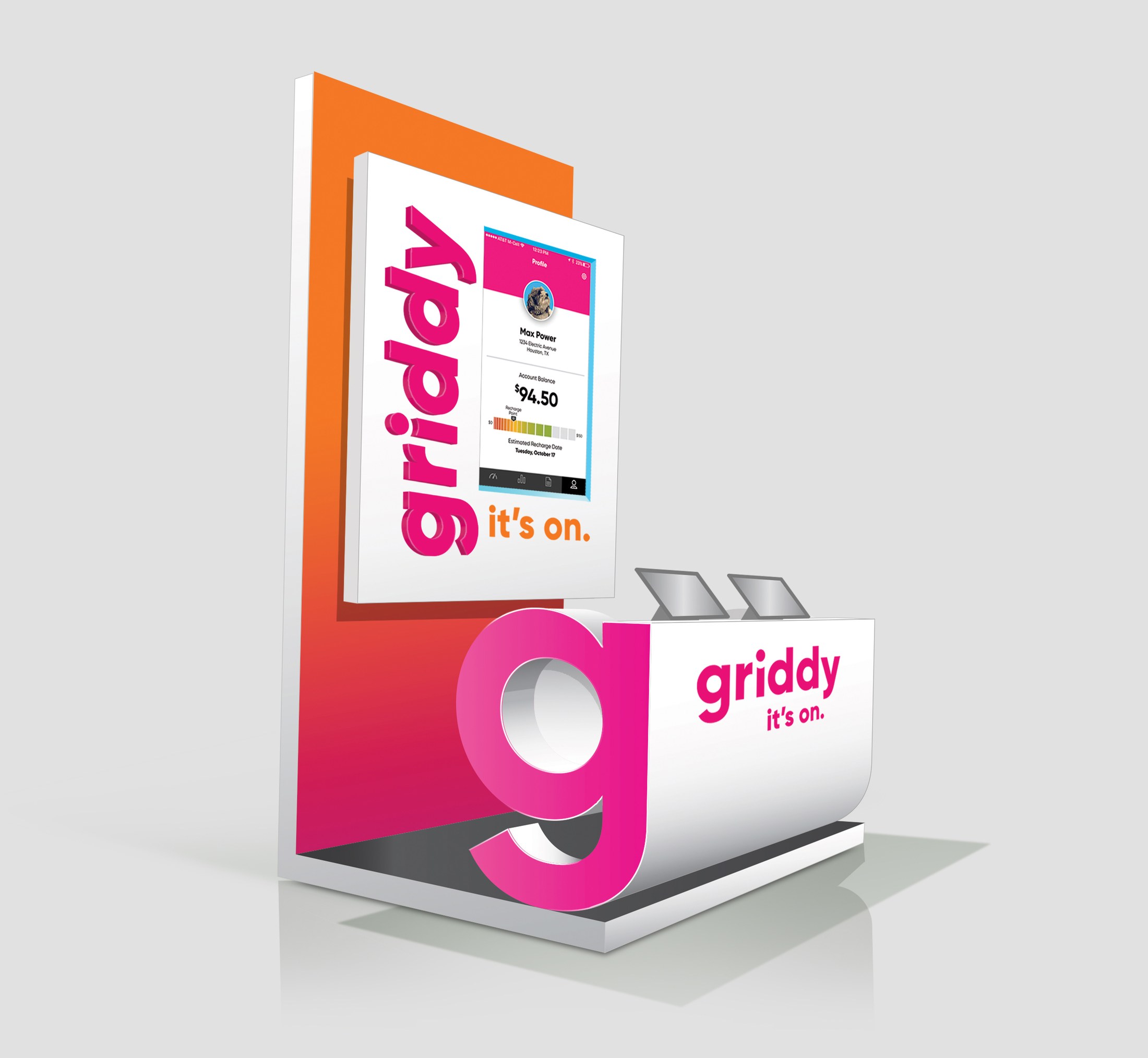
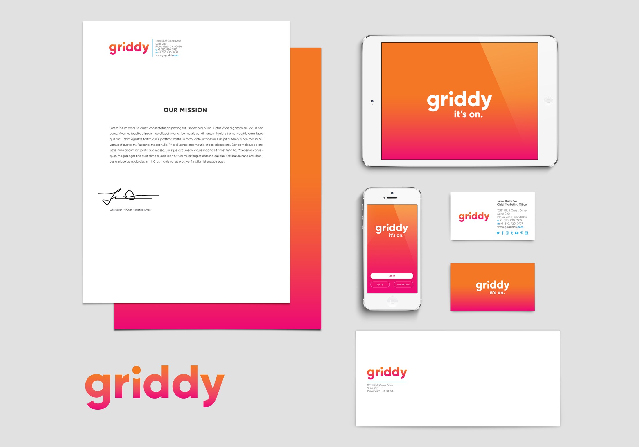
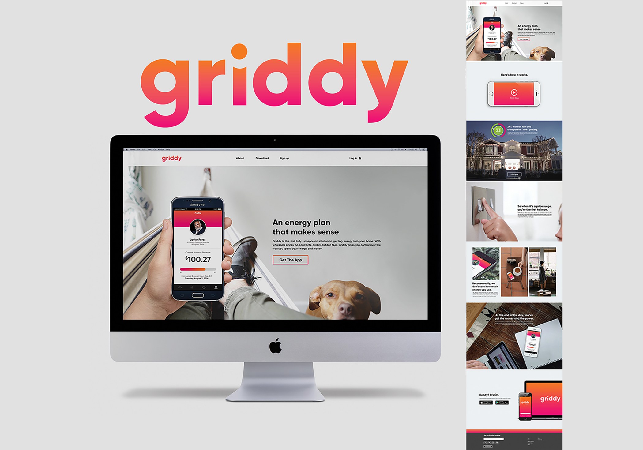
A bright utility brand system designed to make energy savings feel simple, immediate and actionable across app, web, print and campaign touchpoints.
Case Note
Turning an abstract energy offer into a direct, useful brand system.
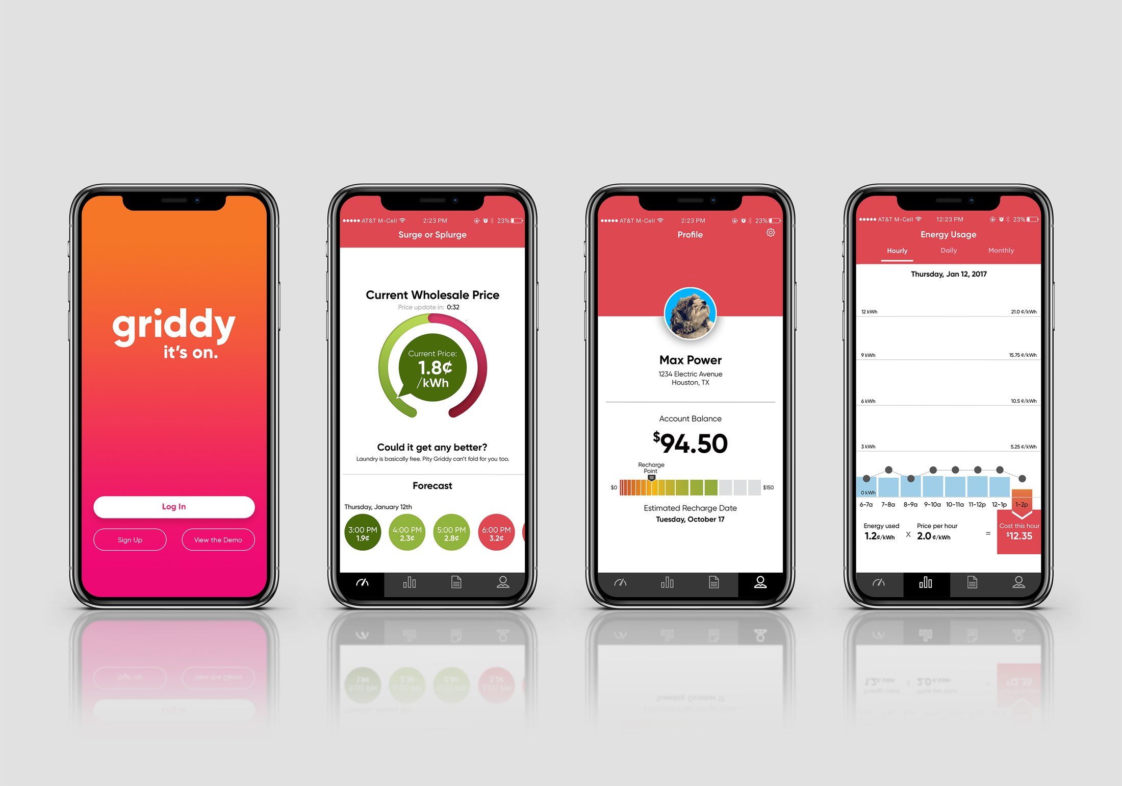
The challenge was communication speed. Energy savings are abstract, so the brand needed to make the benefit feel immediate before users got lost in pricing, plans or technical details.
My role was to create a direct visual and verbal system: high-contrast color, simple forms, interface-friendly assets and a voice that could move from app screens to printed collateral and merch without losing recognition.