Brand Identity · Packaging · Wellness
Oneness
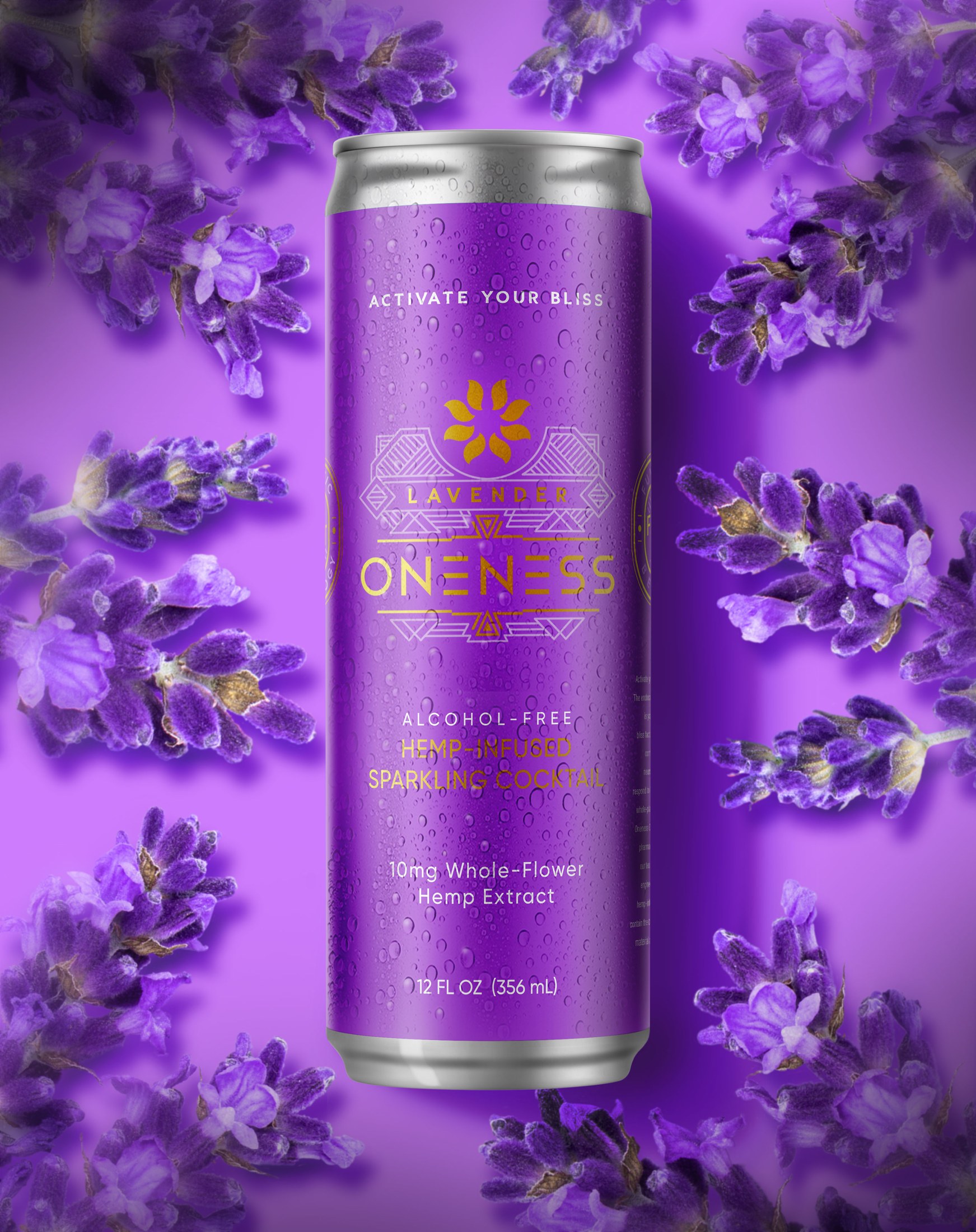
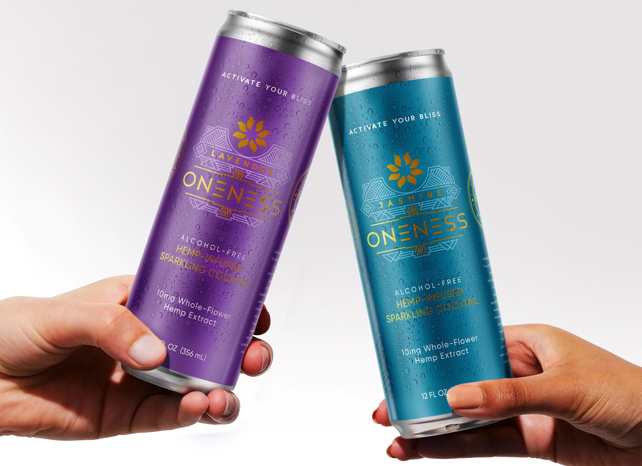
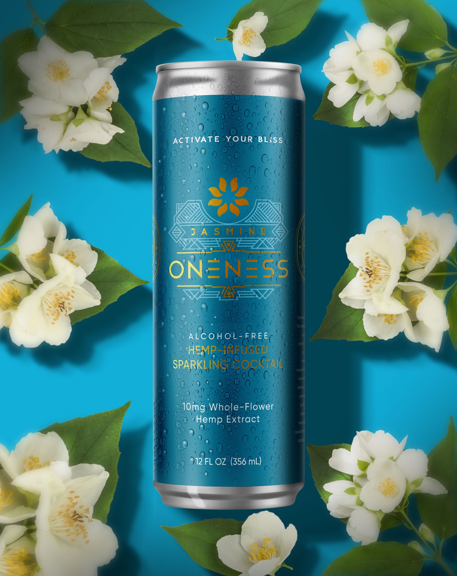
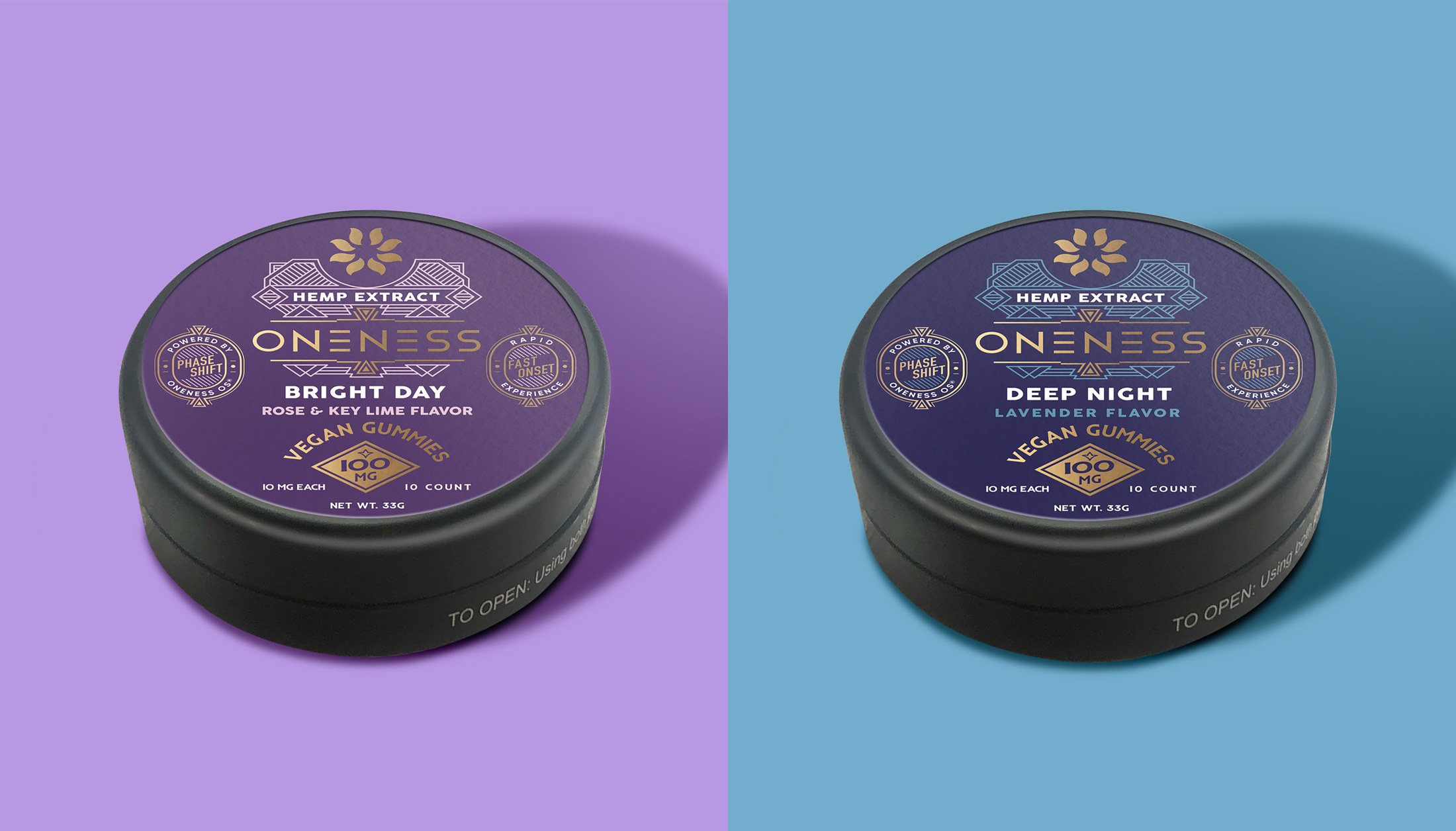
A wellness packaging system built to translate technical product benefits into a clear, premium family: distinct formulas, readable hierarchy and shelf presence without a clinical feel.

Case Note
Making complex wellness benefits feel simple enough to shop.
The problem was clarity. A wellness product can become too technical very quickly, so the packaging needed to organize benefit, formula and flavor information before the customer had to read every detail.
My role was to make the family work as a retail system: color coding, product naming, benefit hierarchy and consistent formats. The result feels premium, but still practical enough for labels, cartons, cans and secondary packaging to share one recognizable structure.